
Brief / Transnomis Solutions Inc. provides up-to-date road and traffic data to municipalities and agencies that need it.
For / Transnomis Solutions Inc.
Role / Brought on as a UI/UX Designer to improve the user experience and standardize visual elements.
Transnomis Solutions specializes in road information management and communications solutions, for agencies with road information, and all that need it.
Problem / When I was hired, the software worked but there was no standardization among the interface or experience. It had been designed by software engineers and programmers. The solution to every new feature was to add a button and a new screen, that was then designed with no template or concept of flow. There were several third party softwares being used for similar purposes (such as modals), each with their own visual elements and layouts. Everything was designed to work but not to be used efficiently.
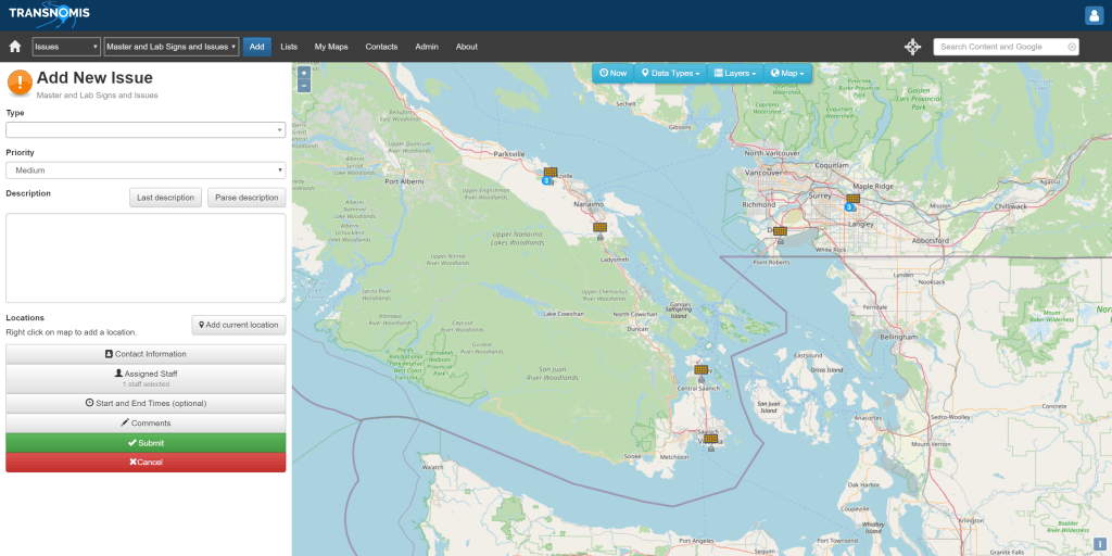
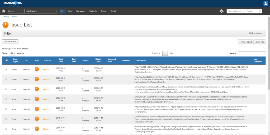
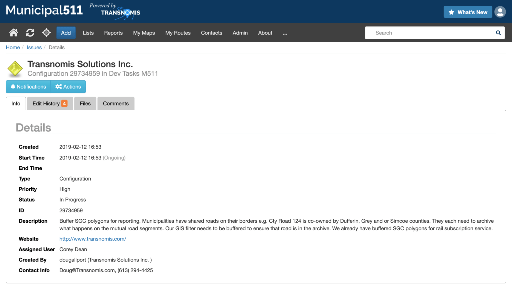
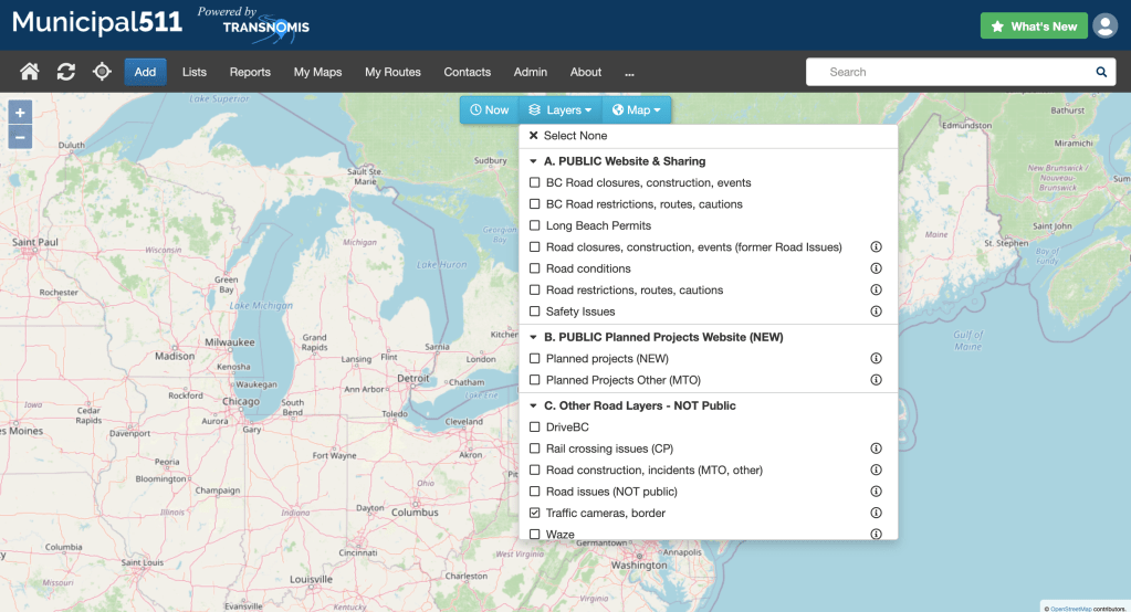
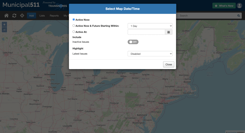
Below are some examples of what the software looked like before I was brought on.


Solution / My solution, for the short term, was to standardize all the UI elements and rules so that there was seamless experience across the software. Another solution would have been to start a complete visual and experiential overall from the beginning but this was not feasible due to resource restraints and a lack of design direction. Therefore, the better solution, at the time, was to streamline the experience and create visual design rules to follow. I achieved this by taking what was there and building upon it. For instance, previously there were 2 different styles of modals being used due to different third party softwares. While I couldn’t eliminate using either software (due to it’s thorough integration), I could customized the CSS and HTML to be standard between both. Other aspects that were improved were grouping similar option selections into subcategories and creating button groups of similar actions. Both of these improved user experience due to improved readability and intuitive flow. Page layout rules were also implemented (such as buttons on the left, pagination on the right, etc.) to make using the software less jarring and easier.
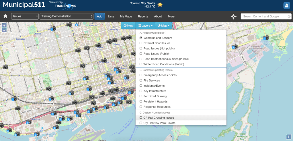
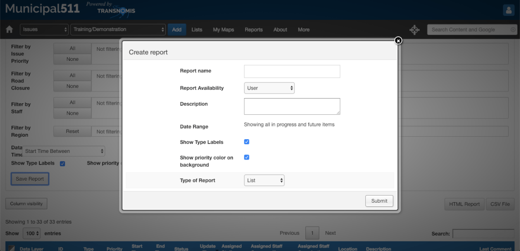
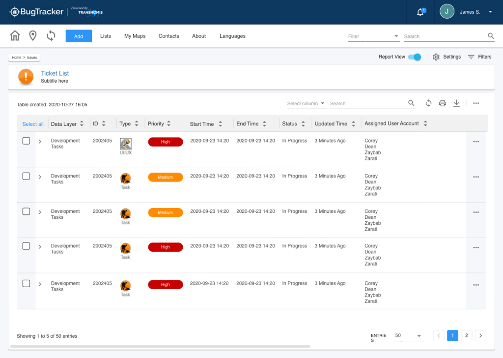
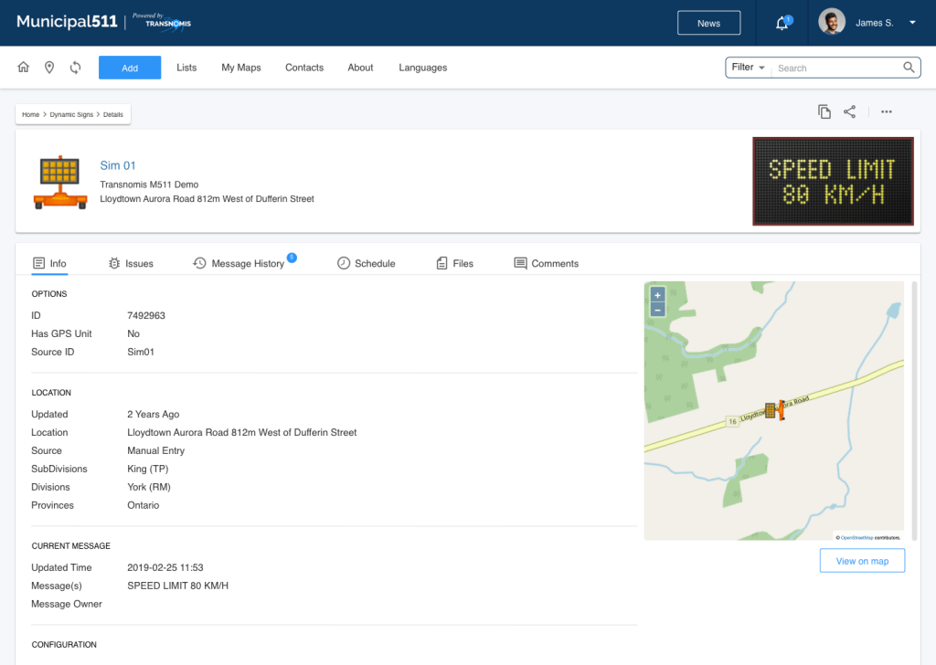
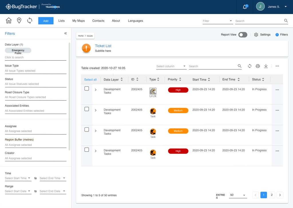
Below are some examples of how the software currently looks (as of July 2022).


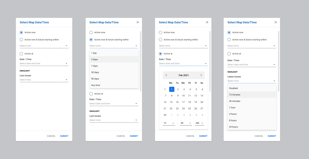
Future / Now that everything has been (more or less) standardized within the current system, it is possible for us to do a complete overhaul of the UI. An UX Design consultant (check her out HERE) was contracted to help us with planning the direction the software should move towards. Working with her, we were able to create some really awesome designs and further improve the experience for the user. Implementation has begun but the end delivery date is still TBD.
Below are some examples of how the software might look like in the future.


You must be logged in to post a comment.